Type Classification
There are a number of type classification systems. The Vox-ATypI system is the current recognized system. The system was devised by Maximilien Vox in 19654. The system was adopted in 1962 by the Association Typographique Internationale. It was also adopted by the British Standards Classification of Typefaces in 1967. The system looks at the main characteristics of a typeface focusing in on aspects like serifs, stroke axis, x-height, and stroke weight differences. There are other classification systems and some websites make up their own classification systems. Click on the category name in order to view more about the particular category.
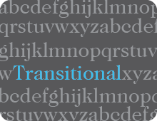
Transitional Typefaces
These typefaces have a noticeable difference in the weight of thick and thin strokes. They may also be called Neoclassical or Realist.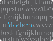
Modern Typefaces
These typefaces have thin, straight serifs with a sharp contrast between thick and thin strokes. They are typically limited in use to headlines because of the contrast.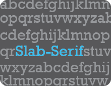
Egyptian or Slab Serif Typefaces
Perhaps the easiest of the serif typefaces to identify because of their heavy, slab like serifs. The strokes tend to have either equal weight or minimal contrast.
Humanist Typefaces
These sans-serif typefaces are derived from handwriting or calligraphic writing. They feature higher variations in stroke weight.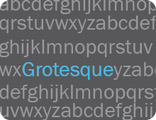
Grotesque Typefaces
These typefaces tend to be idiosyncratic with uneven weight distribution in the strokes. The capital G tends to be spurred.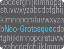
Neo-Grotesque Typefaces
These typefaces lose the awkward curves and idiosyncrasies of the Grotesques. They typically have less variation in stroke weight. They may also be known as transitionals or realists.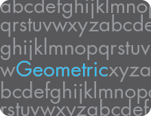
Geometric Typefaces
These typefaces are built around geometric forms. They feature mathematical portions and often have optically circular bowls. The feature strokes of even weights.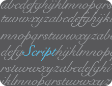
Script Typefaces
These typefaces are based on handwriting and pen-based calligraphic forms. They tend to look like they were created with a pen or brush.