Neo-Grotesque Typefaces
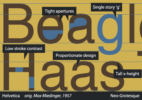
The Neo-Grotesques, also called Transitionals or Realists, include many of the most commonly used sans. They are based on the later Grotesques and take the design of the sans-serif to a new level with their careful construction and aesthetics. They are much more refined than the Grotesques, during which period type designers were still feeling their way around the new style; thus, the Neo-Grotesques lose many of the awkward curves and idiosyncrasies that are common in earlier sans serifs. You’ll see much less variation in line weight, and most often a single-story “g.”
Created with an emphasis on neutrality and simplicity, they were extraordinarily popular among the Modernists and remain popular today. Despite many claims otherwise, simplicity does not directly translate into legibility: A tight vertical rhythm and pinched apertures keep many Neo-Grotesques (including Helvetica) from being good choices for body text. In fact, in the 2013 edition of the DIN 1450 (the German standards on legibility in typefaces, published by the Deutsches Institut für Normung), Helvetica is used as a negative standard. That’s an entirely different topic, however.
In 1957 — a big year for Neo-Grotesque sans serifs, as Frutiger’s Univers as well as Folio (originally thought to be a stronger competitor, although history has proved otherwise) were released — Haas Foundry released Max Miedinger’s Neue Haas Grotesk, which drew heavily on Schelter and Akzidenz Grotesks. In 1960, Haas, in an effort to market it more effectively, rebranded Neue Haas Grotesk to what we know as one of the most ubiquitous typefaces of all time — you guessed it — Helvetica.
Many people love Helvetica so much that they’ll hang prints of vintage Helvetica specimens as decoration.
The quintessential members of this group are, of course, Univers and the immortal Helvetica, which has gone through quite a number of permutations over the years (as have all of these typefaces) and was recently revived by Christian Schwartz as a rerelease of Neue Haas Grotesk. A nice informational minisite was created by Indra Kupferschmid and Nick Sherman for the release. Other typefaces in this category include the DIN 1451 and its derivatives, and Bell Gothic and its successor Bell Centennial.
Source
Alessio, Joseph. "Making Sense Of Type Classification (Part 2)." Smashing Magazine. N.p., 19 June 2013. Web. 27 Apr. 2014.