Grotesque Typefaces
The Grotesque category covers the early sans serifs, specifically those designed in the 19th century and the first decade or two of the 20th. Many of these typefaces had only capitals or exist only in centuries-old specimen books, but a number of them are still quite commonly used. These typefaces tend to be very idiosyncratic, with awkward weight distribution around bowls of characters and irregular curves.
Monotype Grotesque (above, 1926), based on Berthold’s much earlier Ideal Grotesque (1832), is an excellent example of the quirks commonly evident in Grotesques. Note the awkward “a” and “g,” the squarish bowls, the odd curves and angles at the tips of strokes in the “J” and “S,” and the overall irregularity.
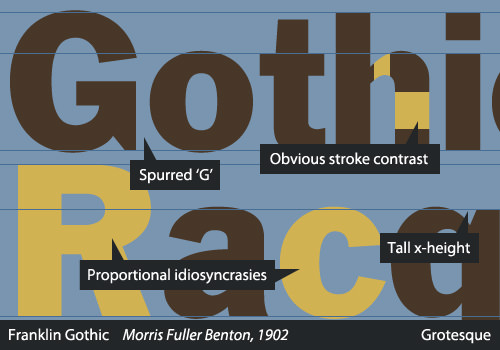
The capital G in a Grotesque is usually spurred, and the British Standards specifies a curled leg on the capital R, although that is not apparent in many typefaces of the period. They tend to display some variation in the thickness of strokes, but the contrast does not show calligraphic influence or a logical pattern. The style became more sophisticated over the course of the 19th century. Perhaps the finest sample of this category appeared in the Berthold Type Foundry’s 1896 release of Akzidenz-Grotesk, which, along with Schelter Grotesk (1886), served as an archetype for many Neo-Grotesques, most notably Neue Haas Grotesk and Univers.
Interestingly enough, it has been postulated that Akzidenz-Grotesk was based on Walbaum or Didot. Despite looking extremely different at first glance, a simple comparison of the basic forms shows that the metrics are very similar.
Examples of the Grotesque category include Franklin Gothic, Monotype Grotesque and Schelter Grotesk.
Source
Alessio, Joseph. "Making Sense Of Type Classification (Part 2)." Smashing Magazine. N.p., 19 June 2013. Web. 27 Apr. 2014.