
Typesetting Terminology

Dingbat
A typographic ornament or graphic. Dingbat fonts are digital type where each character is a small graphic or icon — picture fonts. Dingbats can be decorative or functional.
Fleuron
A typographic element, or glyph, used either as a punctuation mark or as an ornament for typographic compositions. Fleurons are stylized forms of flowers or leaves; the term derives from the Old French word floron for flower.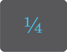
Fractions
A number usually expressed in the form a/b. When typesetting a fraction, you typically use a supescript number for the numerator (top) and a subscript number for the denominator (bottom) with a forward slash between them.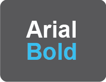
Font
A specific variation within a typeface family.
Glyph
A glyph is an image, often associated with one or several characters in the case of a ligature.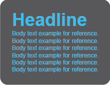
Hierarchy
A typographic hierarchy expresses the organization of content, emphasizing some elements while subordinating others. A hierarchy allows readers scan a text and easily access the pertent information.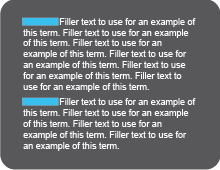
Indent
A space at the beginning of a written line or paragraph. The first line of each paragraph is shifted to the right by a small amount, usually one or two ems (space equal to a lowercase m).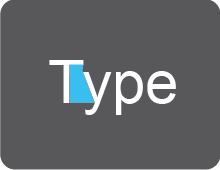
Kerning
Kerning is used to refer to the adjustment of the space between letters and words.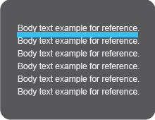
Leading
Leading refers to the space between lines of type. Leading is measured from one baseline to the next baseline. The term comes from when actual strips of lead were used between lines of type on a letterpress.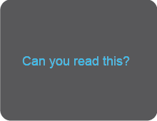
Legibility
The quality of being clear enough to read. This is an important factor when choosing a typeface for a project.
Length of Line
Also referred to as line measure. It is simply how long a line is described in picas and points. It relates to the width of a column of text most often.
Letterspacing
Letterspacing refers to the process to create consistent spacing within a group of letters. Also called tracking.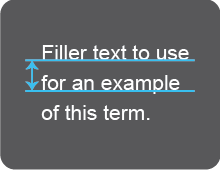
Linespacing
The distance from the baseline of one line of type to another is called line spacing. It may also be called leading.
OpenType
A hybrid font format that can accomodate TrueType or PostScript type formats. OpenType fonts work on Macs and PCs unlike TrueType and PostScript that are platform specific.
Quad
Originally, it was a piece of lead that goes into between words. Now, it still refers to the space between words in lines of type.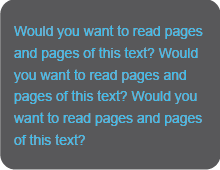
Readability
The ease in which text can be read and understood.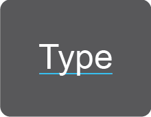
Rule
A typeset line that may be used alone or as an outline of a shape. It can be in varying thicknesses measured in points.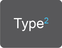
Subscript
A letter, figure, or symbol written or printed below the baseline.
Superscript
A letter, figure, or symbol written or printed above the line.
Symbols
Punctuation marks and special purpose characters comprising a complete type font. They include asterisks, bullets, daggers, dingbats, ellipsis, copyright, registration, and trademark symbols. May also be referred to as typographic symbols.
Symmetrical
Layouts or compositions that are identical on both sides of a central line. If you folded the page in half, both sides would match up exactly.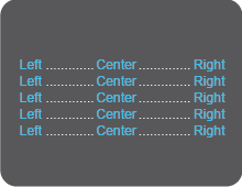
Tabs
A point at which text advanced with the tab key will align. Tabs can typically be set to left align, right align, and center. They may also include leaders like dots or lines that go until the tab.
Tracking
Tracking refers to the process to create consistent spacing within a group of letters. Also called letterspacing.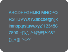
Typeface
A single design of type compromising the full alphabetand all corresponding fonts.
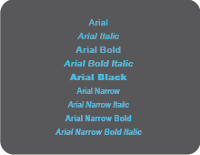
Typeface Family
All the collective variations (fonts) of a typeface.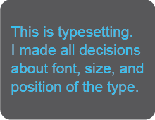
Typesetting
The practice of composing type on a page.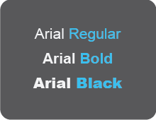
Weight
The varieties of related character sets within a typeface; text faces typically contain roman (regular), bold and italic versions at minimum.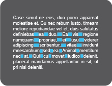
White Rivers
A series of white spaces running through consective lines of type. These spaces form a weaving white line through the text that is very noticeable. They occur most frequently in justified text and should be avoided. May also just be called rivers.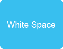
White Space
The space in and around typeset characters. This space is as important as the text on the page.It gives the eye a chance to rest.
Word Spacing
The standard white space between each word in a typeset copy. It is typically one-third of an em for lowercase letters and one enfor caps.